Accessiblity considerations
Do not rely upon color as the sole means for conveying information in charts (or in general). To make charts accessible, combine color with another means of distinction. This could be the use of patterns or symbols combined with or instead of colors. Lightness vs. darkness can also serve as a secondary distinction; however, the visual difference between shades must be large enough to be clearly perceived. You can also add text, such as labels or descriptions of the visual information in the chart.
Adding a thin separating line between adjacent colors, such as a one-pixel white border is helpful to visually distinguish areas but should be combined with at least one of the above recommendations.
Accessible chart examples
Clearly labeling elements within a chart or graph is very explicit and can enhance the experience for all users.

Using symbols to differentiate between elements removes the reliance on color alone.

Incorporating patterns with color further differentiates elements.

Color usage
When creating data visualizations, care should be taken to select colors geared towards the type of data being presented. General color palettes created for web UIs and/or marketing purposes are not always suitable as the colors can lack contrast and distinguishability or else be visually unsuitable when used together in a data context. Keep in mind that color choice can also impact meaning.
There are three main types of color palettes used for data visualization:
- Categorical palettes
- Sequential palettes
- Diverging palettes
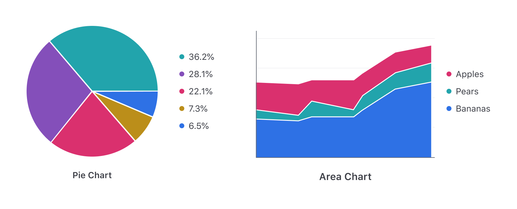
Categorical palettes
Use for presenting categorical data that has no intrinsic order, such as a pie or donut chart. Also used for multi-line charts, area charts, stacked or grouped bar charts, etc.
Categorical palettes should:
- Use distinct colors.
- Be limited to a max of 10 colors.
- Be distinguished primarily by hue. (For accessibility, also use patterns, symbols, or text.)
- Avoid problematic color pairs (e.g., red-green, an issue for those with color blindness).
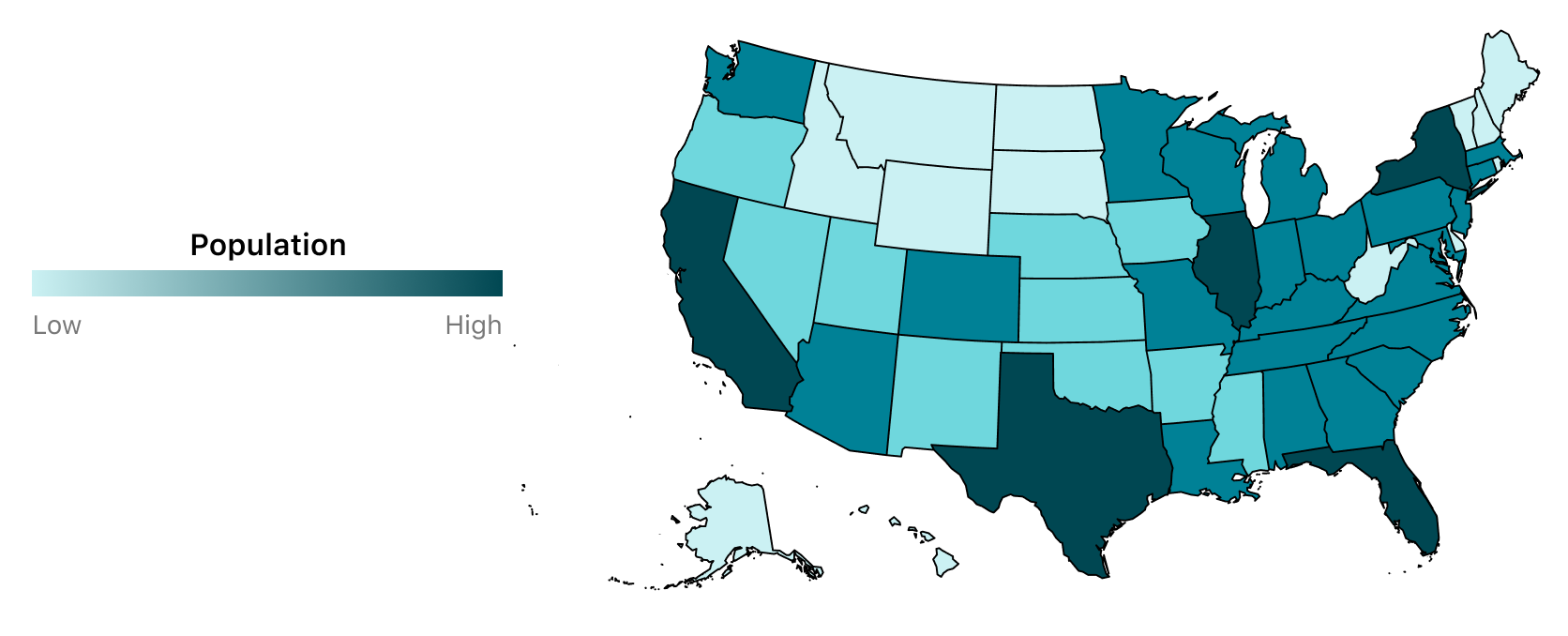
Sequential palettes
Use for presenting quantitative or inherently ordered values in a continuum. Useful for heat maps and grouped horizontal bar charts comparing sequential groups such as age ranges, etc.
Sequential palettes should:
- Vary lightness or hue to create a graduated color sequence (e.g., light blue to dark blue, blue to yellow)
- Ensure enough contrast between the lightest and darkest colors to make differences easily perceivable.
A graduated color sequence can distinguish elements in visualizations without inherent axes or directions, such as maps or geographic representations.
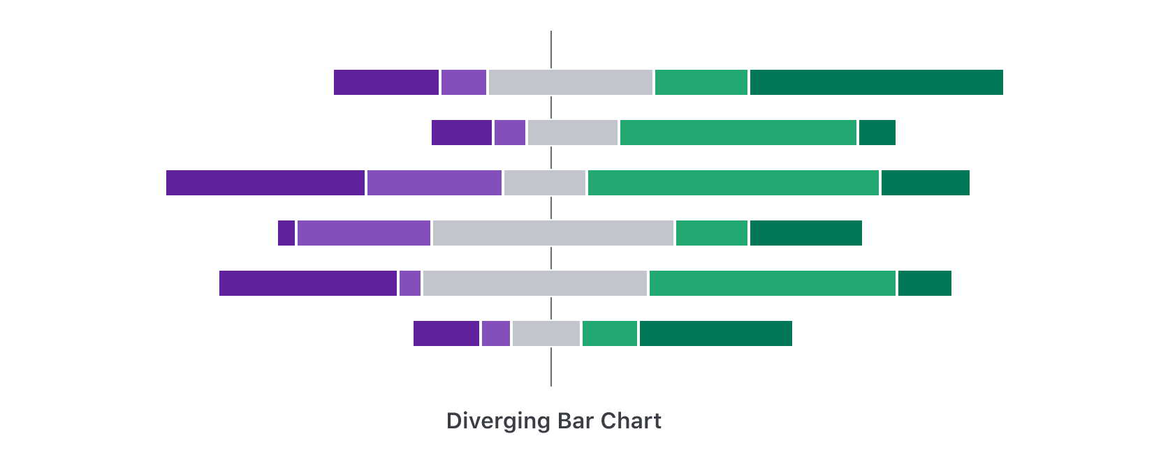
Diverging palettes
Use for presenting two sequences of ordered values with a shared central value. Useful for diverging bar charts, horizon charts, heatmaps, etc.
Diverging palettes should:
- Vary lightness to create two graduated color sequences.
- Contrast the two color sequences by using different hues.
- Use lighter values for colors converging towards the center.